With the premium and beautifully crafted lettering that is combined with the bold, authoritative stencil detail in Auguste Sans by Weekend Type, our logotype balances our story of sophistication and strength. Reflective of our vision, we want people to be left inspired and that change feels possible.
A monogram of the B and D stands in where the wordmark has no room. Both are outlined artwork; neither depends on a font being installed.
Primary Logo
Our primary logo is often used for when there is sufficient space to use it. As a logotype, people can instantly remember our name. This can include the header of our website, to a publication or a piece of merchandising.

Monogram
Our condensed, monogram adaption of our logotype brings an editorial feel to our identity. Just like publisher logos on a book spine, our monogram is typically used for smaller scale formats, although there are exceptions. For example, we can use our monogram for social media avatars, our favicon or digital on-screen graphics.
The favicon.

A social avatar.
An on-screen graphic.
Variants
| Variant | Artwork | Use |
|---|---|---|
| Wordmark | BlackDoctor, 1037 × 150 |
The primary mark: site header, footer, documents, anywhere the name should read |
| Monogram | The BD ligature, 181 × 150 |
Where the wordmark would fall below its minimum size |
| Tagline lockup | Wordmark over Where Culture Meets Care | Covers, title cards and endframes; never in the site chrome |
| Avatar | Monogram centred on a gold circle | Social profiles and the email signature |
| Favicon | The avatar cropped for the tab | Browser tabs and home-screen icons; served from the site |
| BlackDoctor House, BlackDoctor Pro, BlackDoctor Health On Point | Wordmark with the sub-brand name set alongside it | Sub-brand identities; the suffix sits in warm grey in the design file |
The wordmark, monogram, tagline lockup and three sub-brand lockups can be previewed and exported at any size and in every approved colourway from the Logo Tool. The avatar and favicon are the monogram in Black on gold, produced as fixed assets rather than tool exports, because the round avatar needs a disc the tool's rectangular backdrop cannot draw.
Colourways
In different scenarios, our identity will use different background colors. For best visual impact and consistency, we use the black version for both the full logotype and monogram on all background colors. For situations where we use a black background, the white version of our full logotype and monogram will be used.
| Mark | Ground | Where it is used |
|---|---|---|
| Black | Paper | The site header, print on paper |
| White | Dark | The site footer and the cover |
| Paper | Black | Print on black |
| Black | Gold | The avatar and favicon |
| Gold | Black | Accent settings on black |
Black on every light ground.

White on black.
Gold is never the mark on paper: at 1.69:1 it does not read. The sub-brand lockups export single-colour; the two-tone setting with the grey suffix is a design-file convention for now.
Clear Space
For maximum visibility, impact and consistency, we have set a clear space around our logos that should be followed. This clear space has been determined by half the height of the ‘B’ (X). No other graphic element or typography should cross into this space, however there are exceptions with margins.
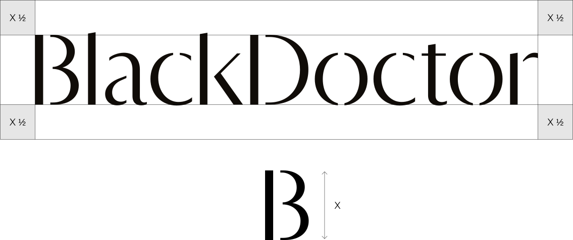
The wordmark.
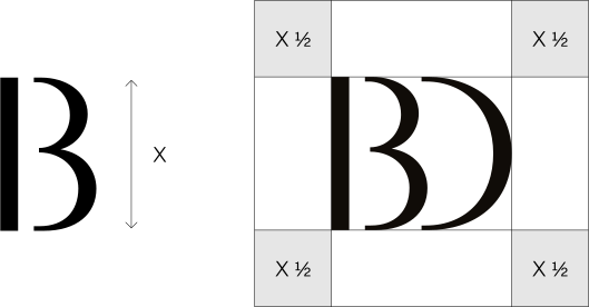
The monogram.
Scaling
Our logotype has been crafted and optimised to ensure maximum readability when working at a smaller scale. There are no rules at large scale, however when the full logotype goes below 25px height, we recommend that you switch to using the monogram.
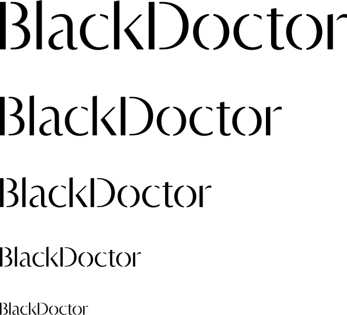
The wordmark at decreasing sizes.

Below 25 px height, switch to the monogram.
Tagline Lockups
When we want to include our tagline with our logo, we have considered their lockups for both the full logotype and the monogram.

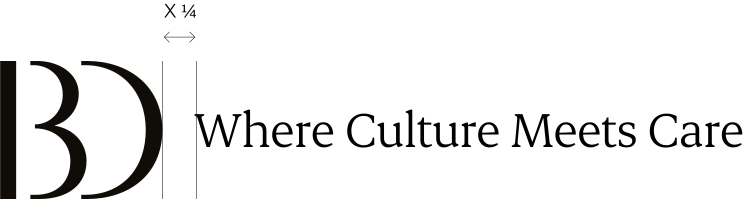
Monogram, horizontal.
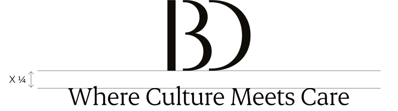
Monogram, vertical.
Partnership Lockups
When we partner with other brands, use the version of our logo that harmonises well with the partner logo. Each lockup follow different spacing rules to make the overall composition feels balanced and impactful.

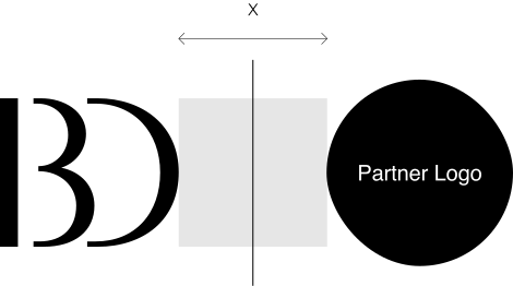
Monogram, horizontal.
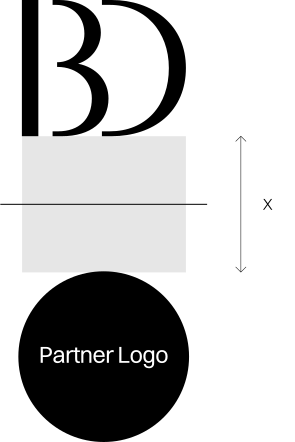
Monogram, vertical.
Brand Extensions
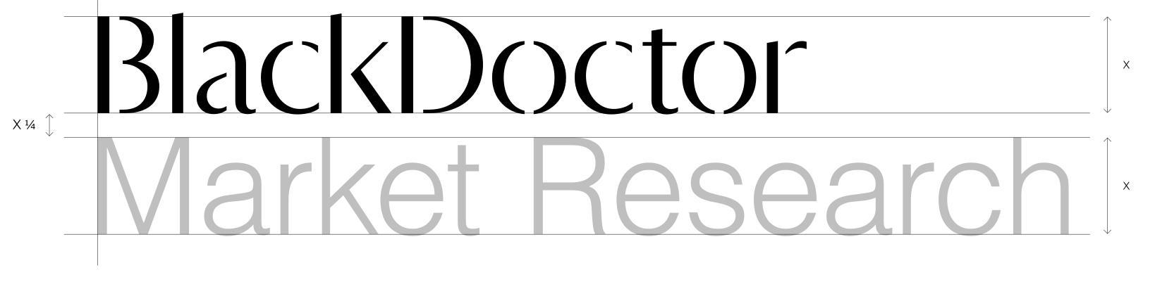
If we need to extend our brand for additional initiatives, you can do so by adding the extensions either next to the logotype or underneath, depending on the length of the extension name. The extension needs to be set in Helvetica Light, have the same cap height as the logotype (X) and has a gap that is a quarter of X. In terms of colour, this can be chosen depending on the context of the brand extension.

Positioning
How our logo is placed on a page should work well with how the rest of a page is laid out. Here are successfully examples of where both our full logotype and monogram can be placed.
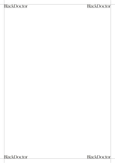
Logo position works in any corner of a page depending on layout of overall design
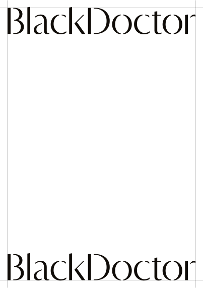
At larger scale, the logo can sit at the top or bottom of a page.
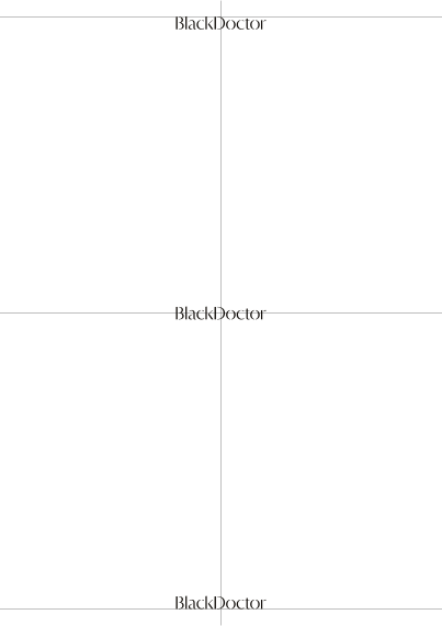
Centralizing the logo works well when making a design full premium and sophiscated.
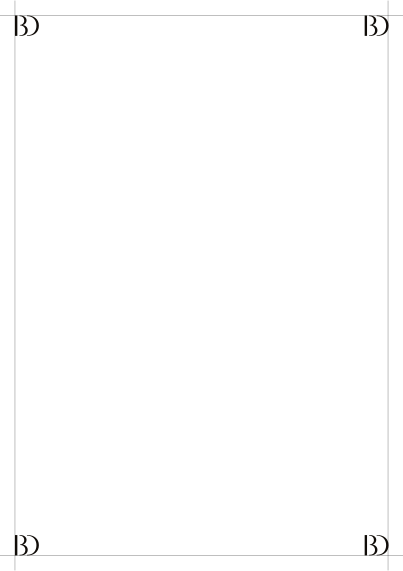
Monogram position works in any corner of a page depending on layout of overall design
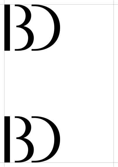
At larger scale, the monogram can sit at the top or bottom left of a page.
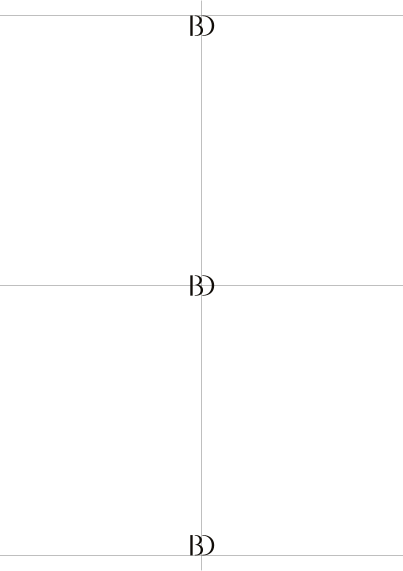
Centralizing the monogram works well when making a design full premium and sophiscated.
Misuses
It is crucial that our logo is consistent in its appearance and it is handled with care. Here, we have outlined a few examples of which our logo should never be used. The same examples apply to the monogram.
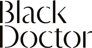
Do not stack the logotype

Do not change the proportions

Do not use multiple colors
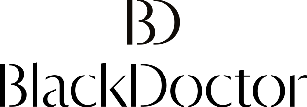
Do not use both the full logotype and monogram together

Do not use gradients

Do not use a keyline stroke outline
Exporting the logo
Use the Logo Tool. It exports SVG, PNG and JPG at the width you set, in every colourway above, with the ground flattened into JPG and left transparent in SVG and PNG. The rules on this page are built into the tool.