BlackDoctor is black ink on warm paper with a single gold accent. Everything else is a step on one of two scales — a neutral scale from paper to black, and a gold scale from tint to ink — plus two soft highlighter surfaces. The values below are the brand's Figma variables; the web tokens that express them are on the Website colour page. Hover or tab into any swatch to copy its hex value or its CSS variable.
Core palette
- Black is the ink — text, primary buttons and rules.
- Paper is the page ground.
- Gold is the accent — fills, selection, highlights, and text on black or the dark page.
- Warm grey is a surface and graphic colour only. It is 2.65:1 on paper and never carries text.
Print equivalents come from the brand book, not from these hex values.
| Name | Hex | RGB | CMYK |
|---|---|---|---|
| Black | 00/00/00 | 60/40/40/100 | |
| Off White | 244/241/237 | 05/05/07/00 | |
| Yellow | 239/177/77 | 06/35/76/00 | |
| Brown | 157/148/136 | 37/33/40/15 |
The brand book names these Black, Off White, Yellow and Brown; this page calls the same four Black, Paper, Gold and Warm grey, after the job each does on the page.
Gold scale
Gold is a scale, not one colour, because the brand gold cannot carry text on paper: measures 1.68:1 there, far below the 4.5:1 that WCAG AA asks of text. The 500 step is the gold; the 800 step is the gold that accented words, link underlines and hover states are set in on light surfaces.
- 500 is the brand gold — fills, selection, and the accent on black.
- 700 is for large text and graphics only (3.15:1 on paper).
- 800 is the accent ink — accented text, link underlines and hover states on light surfaces (5.70:1 on paper).
- 100 carries warning surfaces and 900 warning ink.
The steps other than 500 and 800 are provisional stand-ins that hold the gold's hue at a stepped lightness; the final values are being supplied.
Neutral scale
The neutrals are black laid over paper at increasing strength: step 150 is 5 % black, 500 is 40 %, 800 is 70 %. That is why they read as one family.
- 50 is for panels that open over the page, 100 is paper and 150 carries secondary surfaces.
- 400 is for decorative rules and placeholders.
- 600 is the lightest grey that clears 3:1 on paper, so it draws control boundaries.
- 700 is faded text (5.55:1 on paper) and 800 secondary text (8.10:1).
- 950 is the dark-mode page and 990 the ink.
Surfaces
These swatches are semantic tokens, so they follow the theme you are reading in — switch the theme in the header to see each one's dark counterpart.
- Page — light, dark.
- Secondary — light, dark.
- Plain, for cards and inputs on a tinted ground — light, dark.
- Panel, for menus and dropdowns — light, dark.
- Accent is in both themes, and both highlighters are light-only literals that do not flip.
Dark mode is paper inverted: white ink on , secondary text in , and the true gold as the accent, where it measures 9.35:1. The mint highlighter has no web token yet and is recorded as an engine gap, so nothing on the site renders it.
Ratios
Across different applications, there are multiple ways that our colors can be used. Please refer to the examples below as guidance to get an idea of how the different color ratios impact the mood of an application.

Standard Ratio — Where an application is mainly black and off-white, using our yellow as a pop colour and the secondary palette to highlight a small piece of content.

Accent Ratio — Using our yellow accent colour as a background with black only text and graphic elements

Dark Base — Rather than always using a black background, we can also use our brown as a background color for a darker mood.

Standard ratio, on the site.

Accent ratio, in print.
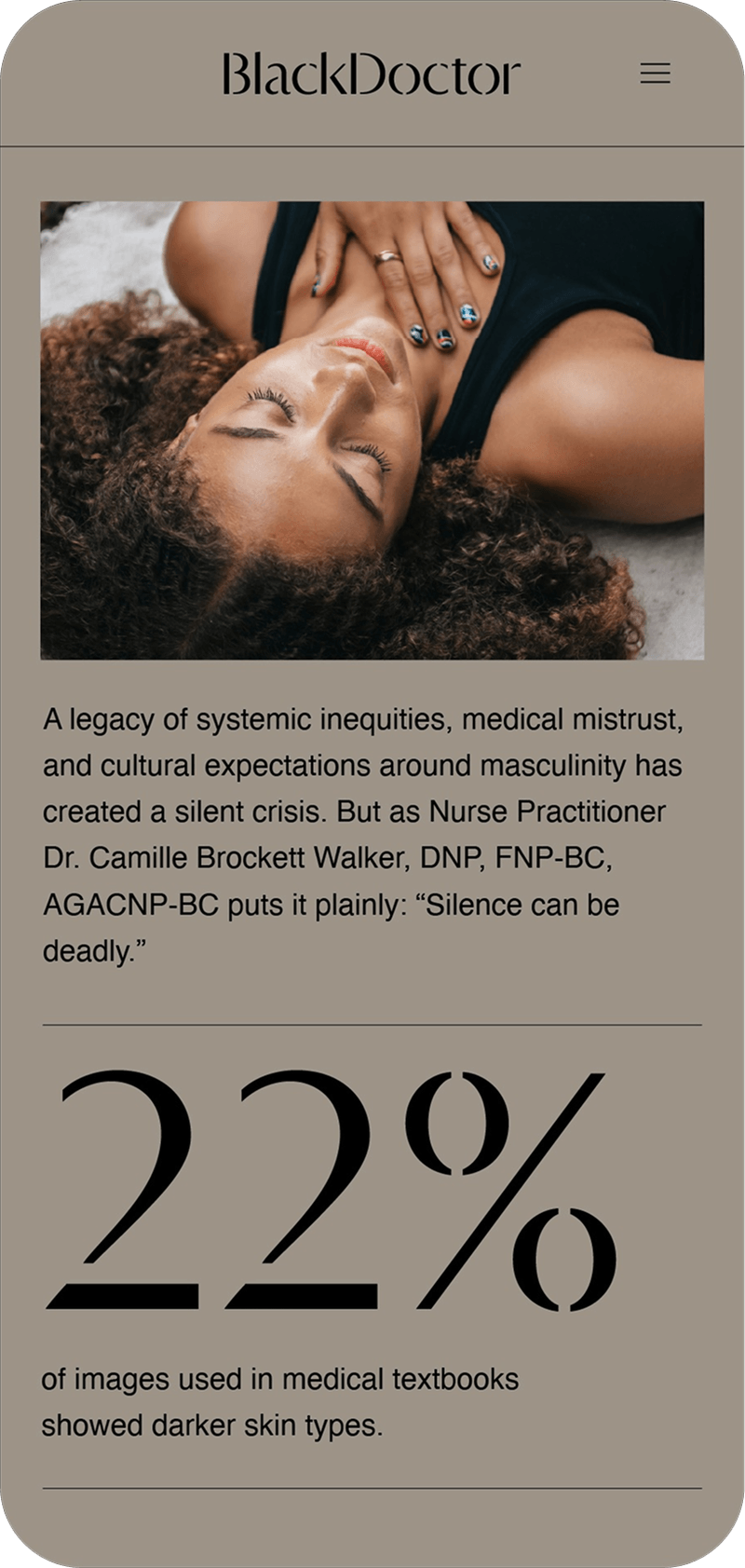
Dark base, on a phone.
Accessibility
All of our colors either for backgrounds or highlighters, have been carefully selected to meet accessibility standards when text is set in black.
Rules
- Gold never carries text on a light surface. Use the 800 step for accented words, link underlines and hover states; link text itself is black. On black or the dark page the true gold is the accent.
- Warm grey is a surface colour. It sits under graphics and behind placeholders; it is not a text colour at any size.
- Faded text is 60 % black, not lighter. Anything lighter fails AA on paper.
- Highlighters carry black text. Both are grounds, never inks.
- Selection is black on gold.
Checking a pairing
Every text-on-background pairing must clear WCAG 2.1 AA. Use the Colour Pairing tool to measure any two palette colours before a pairing ships.