BlackDoctor sets its headings in Erode, a contemporary serif with a sharp, editorial voice, and everything else in Inter. Two faces, two jobs: Erode announces, Inter carries. The sizes below are the design file's; how they translate to the web is on the Website typography page.
Typefaces
| Face | Role | Source |
|---|---|---|
| Erode Variable | Headings and display settings | Indian Type Foundry, distributed free through Fontshare under the ITF Free Font Licence. The website self-hosts Fontshare's build as a stand-in until BlackDoctor's own files replace it |
| Inter | Body text, interface, labels, buttons | Google Fonts, Open Font Licence |
Erode is a heading face. It is never used below 20 px and never at reading size; the one running-text exception is the pull quote, set in Erode italic at 24 px. Inter carries everything else at reading size and every piece of interface.
Hierarchy
Desktop sizes from the design file, in pixels. Leading is a multiple of the size; tracking is the design file's unit.
| Style | Face | Size / leading / tracking | Use |
|---|---|---|---|
| Display | Erode Regular | 94 / 1 / −1 | Hero statements |
| Heading 1 | Erode Regular | 64 / 1 / −1 | Page titles |
| Heading 2 | Erode Regular | 56 / 1 / −1 | |
| Heading 3 | Erode Regular | 48 / 1 / −1 | |
| Heading 4 | Erode Regular | 40 / 1 / −1 | |
| Heading 5 | Erode Medium | 32 / 1.14 / −1 | |
| Heading 6 | Erode Medium | 24 / 1 / −1 | |
| Heading 2X Small | Erode Medium | 20 / 1.1 / +1 | The smallest Erode setting |
| Eyebrow | Inter Medium | 18 / 1.4 / +8 | Uppercase kicker above a heading |
| Body | Inter Regular | 20 / 1.3 | Article text |
| Body Medium | Inter Regular | 24 / 1.5 | Lead paragraphs |
| Body Small | Inter Regular | 16 / 1.4 | Supporting text |
| Body X Small | Inter Regular | 12 / 1.3 | Fine print |
| Caption | Inter Regular | 14 / 1.3 / +6 | Uppercase captions |
| Label | Inter Regular | 12 / 1.3 / +3 | Uppercase labels |
| Token | Inter Regular | 14 / 1.5 | Tags and chips |
| Button | Inter Medium | 20 / 1.3 (16 small) | |
| Nav link | Inter Semi Bold / Medium | 14 · 17 (+5) · 20 (+5) | Site navigation at three sizes |
Type Treatments
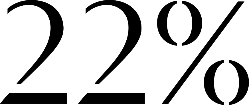
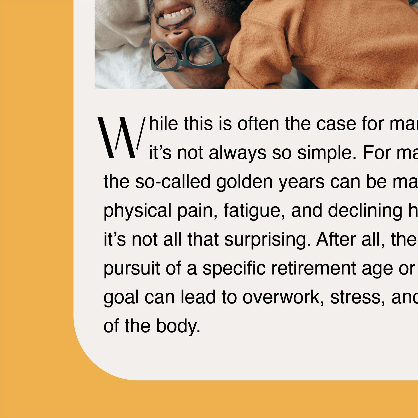
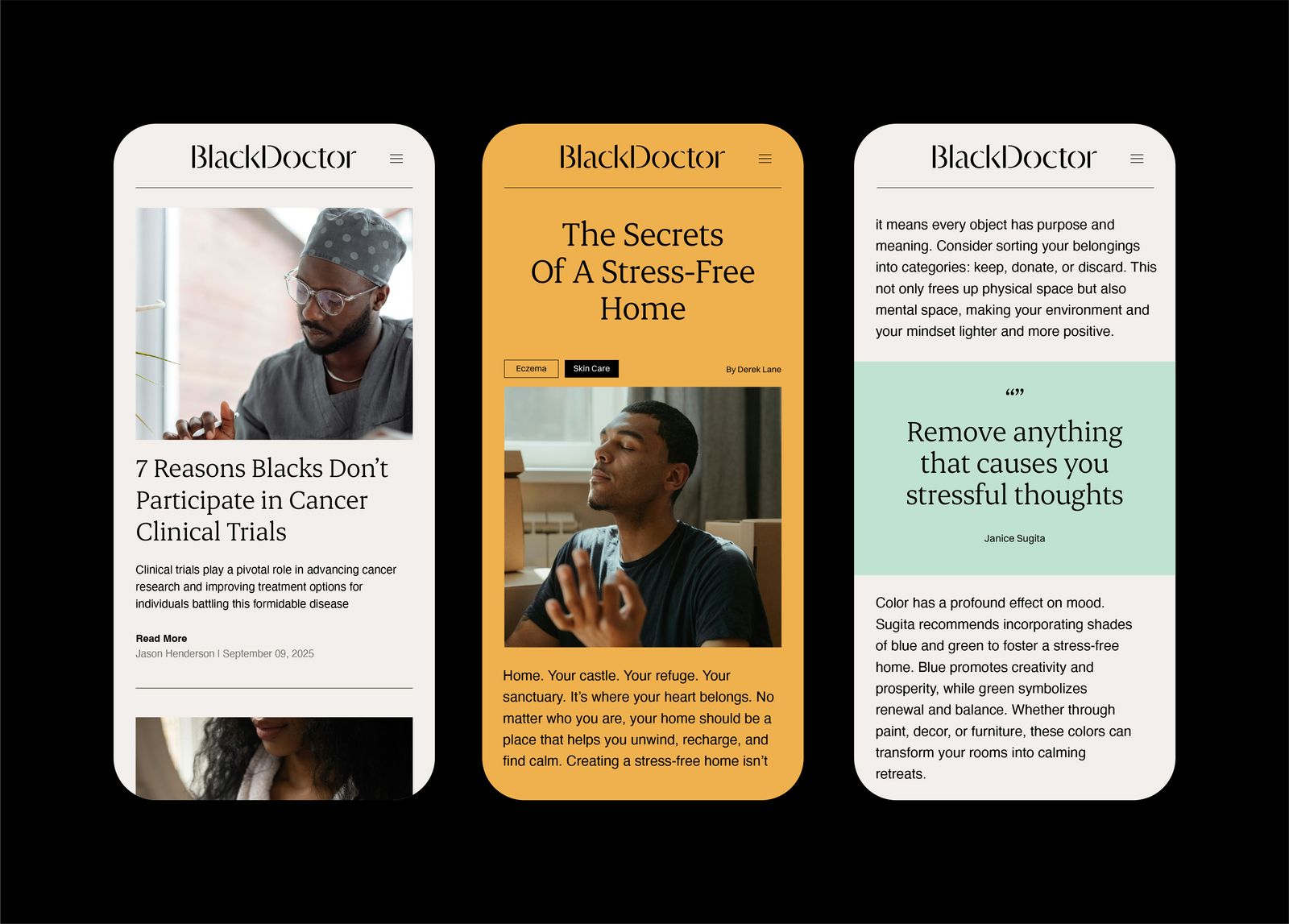
Within typography, there are possible ways we can bring in the characteristics of our logotype, often when the logotype itself isn’t present. Please see the examples below on how we use Auguste Sans within our typographic system:
Grids & Layouts
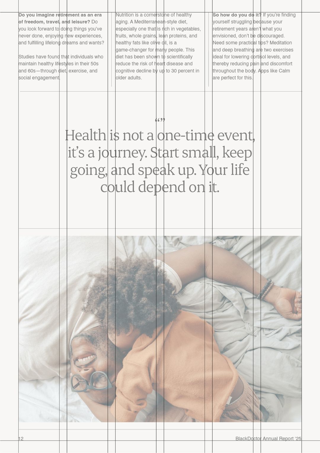
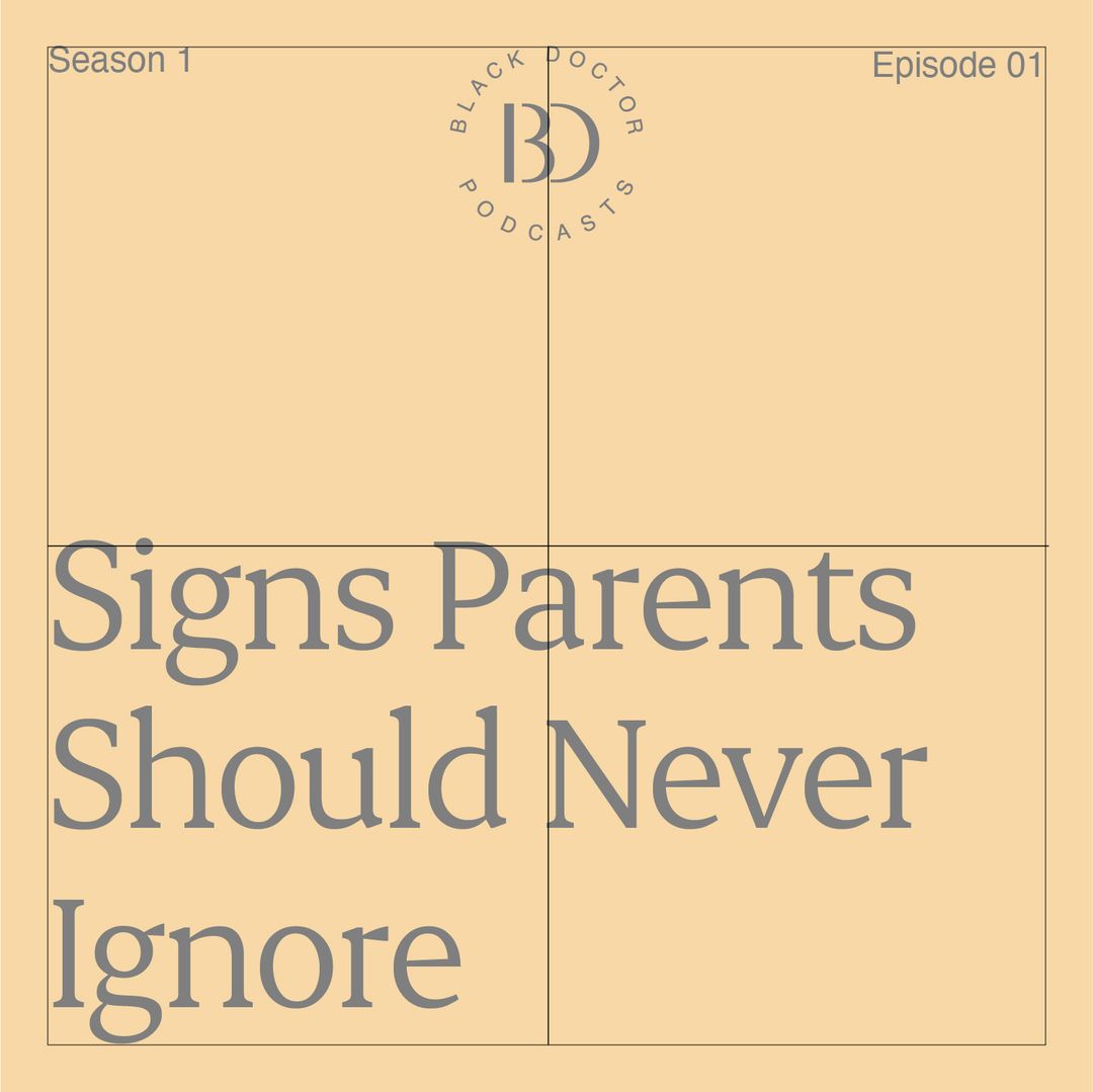
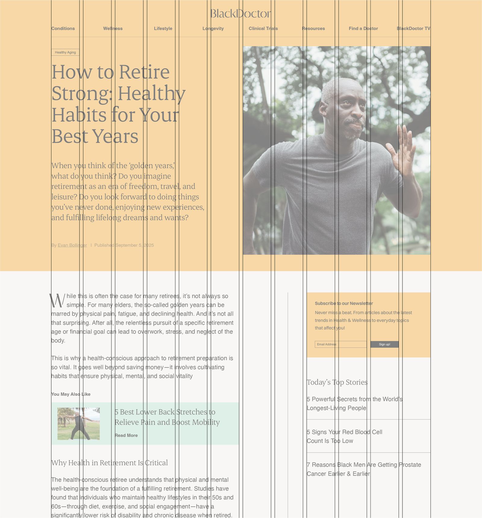
To unite all of our elements together for a page layout, we use grids to ensure our content is accessible and easy to navigate across every touchpoint, both portrait and landscape. Below are a few examples demonstrating how a grid has been used to layout content on a page.
Line Dividers
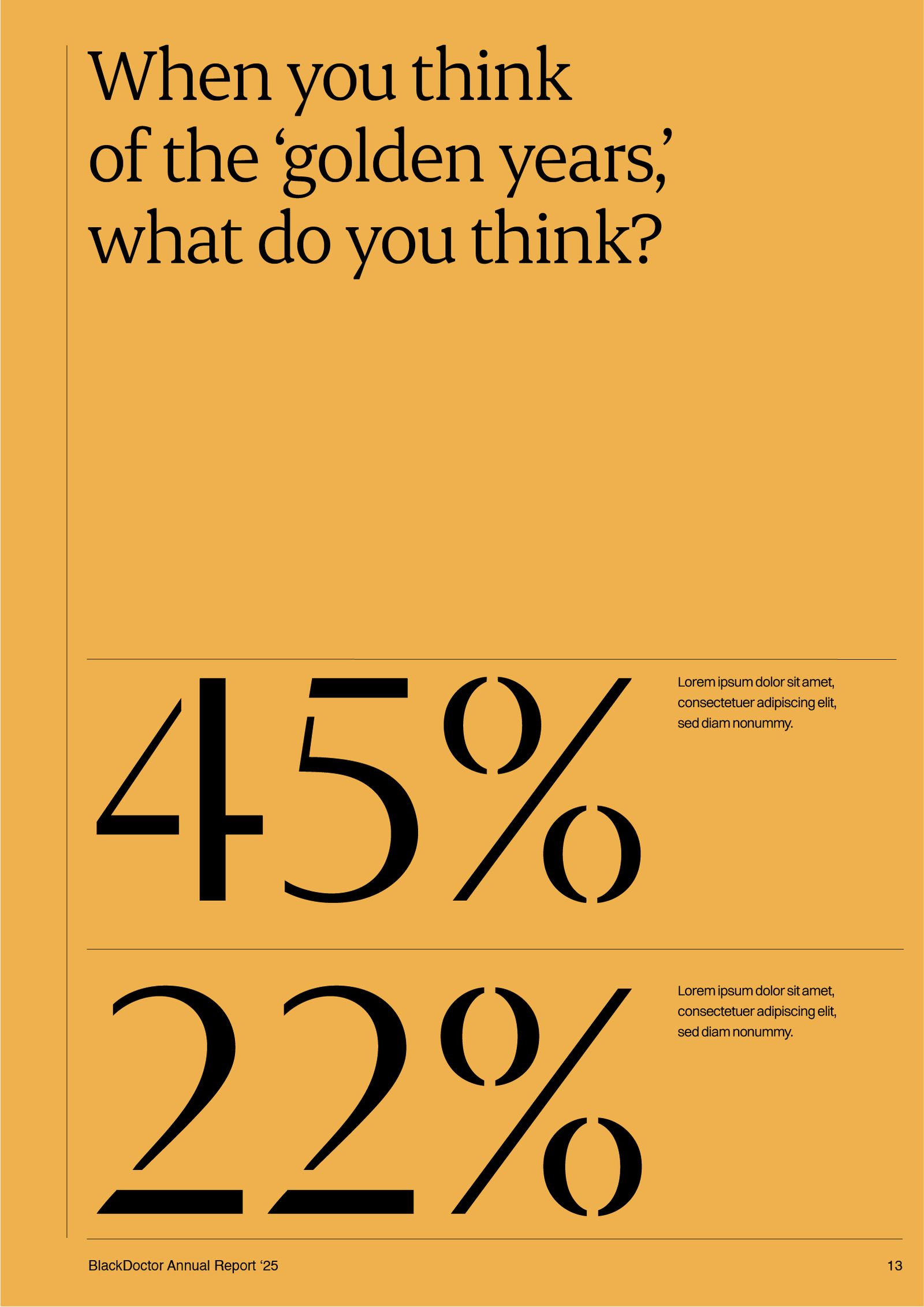
Alongside grid systems, we also use line dividers in our layouts to elevate the editorial feel to our designs. They are also essential for helping organise and establish visual hierarchy, improving readability and help guide the eye, especially those in a higher age bracket.
When using line dividers, please make sure the stroke weight is of approachable weight to the context of the design. For guidance, we typically use a thin weight round 0.5px for digital and 0.5pt for print.
Rules
- Erode for headings, Inter for everything else. The two faces are never mixed in one line.
- Headings sit tight. Leading of 1 and negative tracking; a heading is a block, not a paragraph.
- Tracked-out text is uppercase Inter and small. Eyebrows, captions and labels are the only settings with open tracking; nothing at reading size is tracked.
- No synthetic weights or slants. Erode Variable and Inter supply their own weights; a faked bold or italic is not the brand.
- Erode never goes below 20 px. At small sizes the serif detail closes up; use Inter.